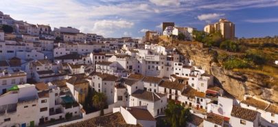
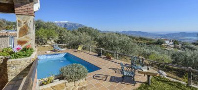
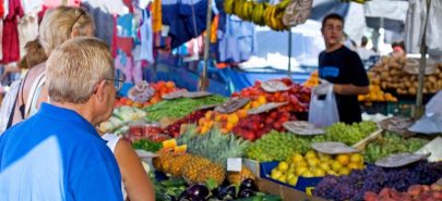
Guess what? We’ve leveled up, and our brand has grown right along with us. Time for a bit of a makeover, and here it is.
Back in 2009, almost a whopping 15 years ago, Ruralidays kicked off with a mission to turn Andalusia’s inland tourism into a top-notch experience.
Loads has gone down since then. We’ve expanded in every way imaginable, and it was high time we built a comfy spot where everything could fit seamlessly. Naturally, our vibe needed a touch-up to keep up—think more sustainable, dynamic, and all-around cool.
“We wanted a brand with broad symbolism, capable of saying a lot by showing very little.”
We needed a fresh graphic universe, a distinctive and shared visual system for all our communication channels.
How did we do it?
By breaking down the whole idea of ‘home’ to its core…
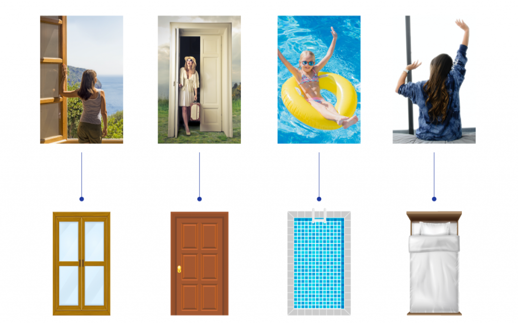
…and nabbing those standout features that truly embody the essence of Ruralidays.

So, here’s the scoop: all these vibes brought us to craft a logo that’s got that fresh pop, loads of vibrancy, and packs a punch of meaning.
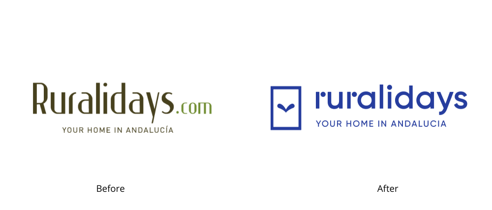
Details matter
As you can see, our new brand encapsulates the philosophy of Ruralidays and all the sensations we want to convey.
Growing without forsaking our roots
Our vision has always been to grow while staying true to our essence. That’s why we opted to preserve our roots through the use of a primary color.
The blue of Andalusia.
As a Spanish song says “Seville has a special color”, but when one envisions Andalusia as a whole, it’s the color blue that takes center stage.
Woven into the fabric of many Andalusian towns, you’ll find it adorning doors, windows, and pots. It mirrors the serene blue of the sea along our coast, echoes in the sun-drenched sky that graces us almost every single day of the year, and even dives into the depths of the pools cherished by Ruralidays houses. The blue of Andalusia was simply a must for our logo.
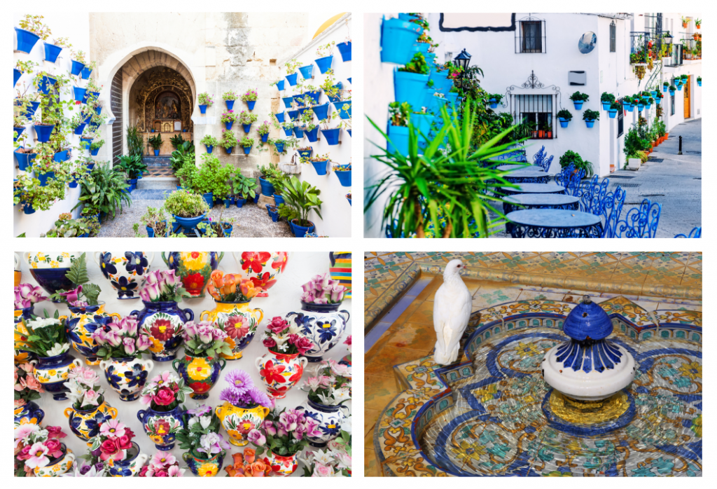
Moreover, this color isn’t just found in Andalusia; it’s also characteristic of many of Spain’s most beautiful towns and much of the Mediterranean.
Optimism and good vibes through our color palette
Blue isn’t going it alone; it’s joined by a palette of lively, cheerful, and saturated colors that are set to complement the photos on our website. That’s right – Ruralidays’ color scheme takes its cues from the snapshots of our homes.

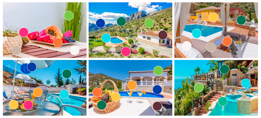
But hold tight, because these colors aren’t just confined to the pixels. They’re out there in the real world, waiting for you to discover during your visits to any of our destinations. Picture the pink of bougainvillea scaling the walls of Andalusian gardens, the classic blue of pots lining the courtyards of Cordoba, or the warm beige of the sand in Bolonia… Fancy more? Well, here you go.
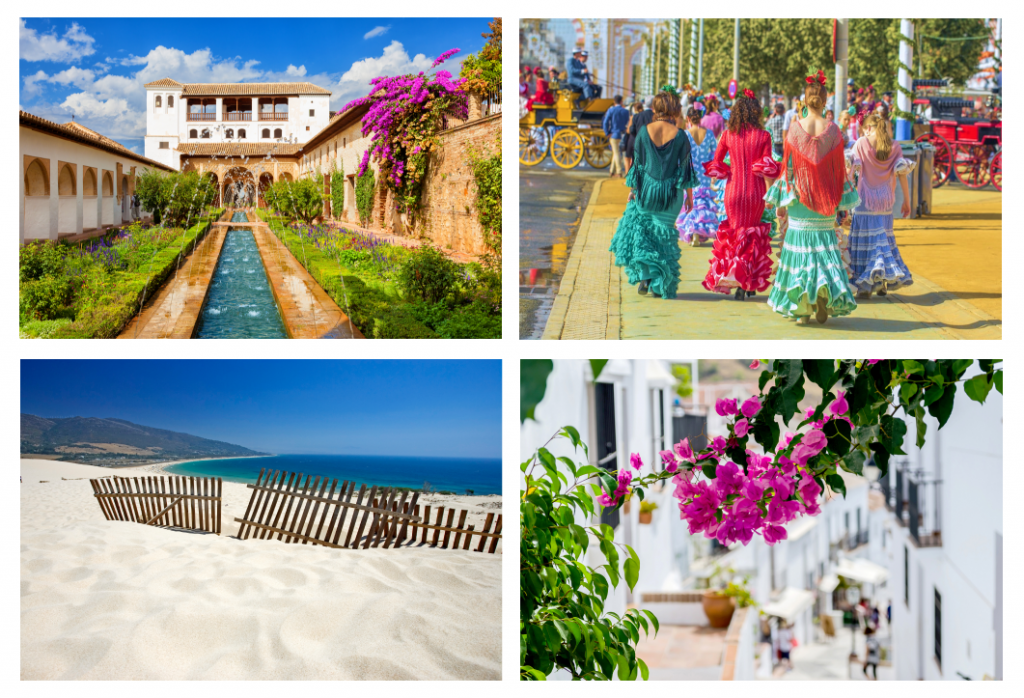
And thus, we’ve pinpointed the very colors that’ll greet you in the finer details of our communication channels. Ruralidays has become a living canvas, reflecting the essence of our homes and the allure of our destinations.
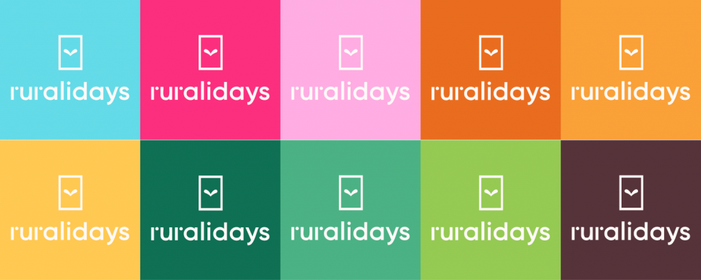
Ready to grow! We present our visual universe
Graphics
Our brand is dynamic and full of life, and that’s precisely why we enjoy a little playfulness with our logo to delineate various categories of products or services.

Iconography
We aimed to convey the joy and warmth that defines Ruralidays in all our endeavors, all while maintaining our commitment to professionalism. That’s why our icons blend the sophistication of clean lines with vibrant, cheerful forms.
The journey began with giving tangible shape and color to our core values…

…and from there, we delved into the rich symbolism surrounding Ruralidays.

Photographic style
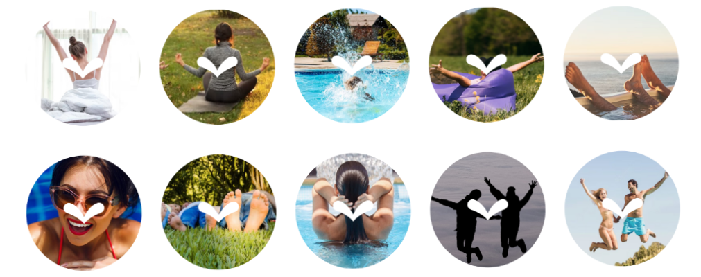
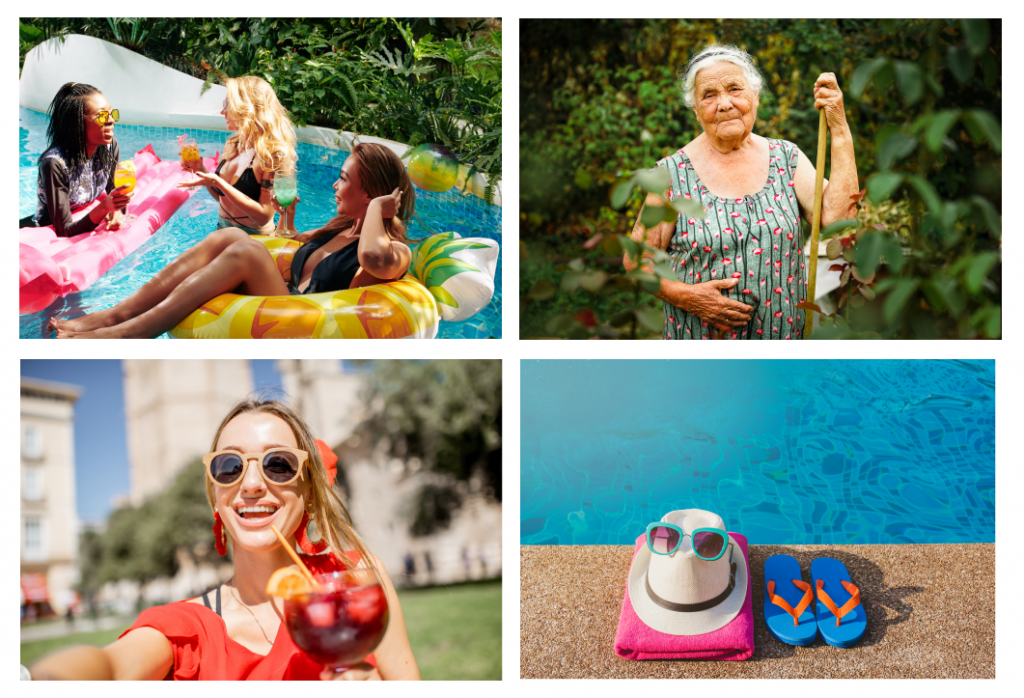
This is all about experiences! Think saturated and lively photographs capturing unique moments and unforgettable experiences.
One brand, multiple uses
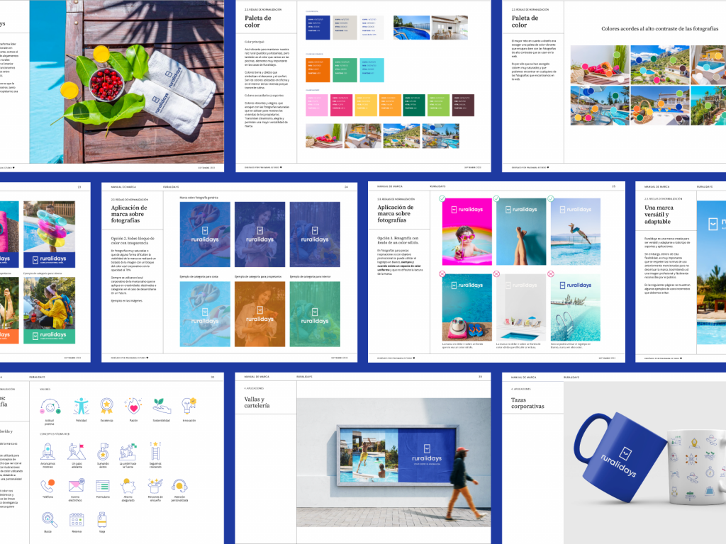
The standout feature of our new brand lies in its adaptability across the digital and physical realms. Go ahead, check it out for yourself!
What’s your take on the transformation? Share your thoughts in the comments on the post and explore the fresh image on our social media.

 (4)
(4)